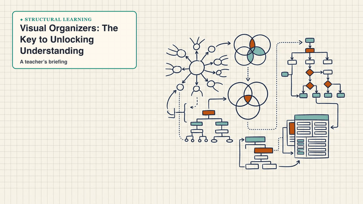
Visual Organizers: The Key to Unlocking Understanding
Discover how visual organizers enhance learning by improving comprehension, retention, and critical thinking skills across all subjects.

Discover how visual organizers enhance learning by improving comprehension, retention, and critical thinking skills across all subjects.
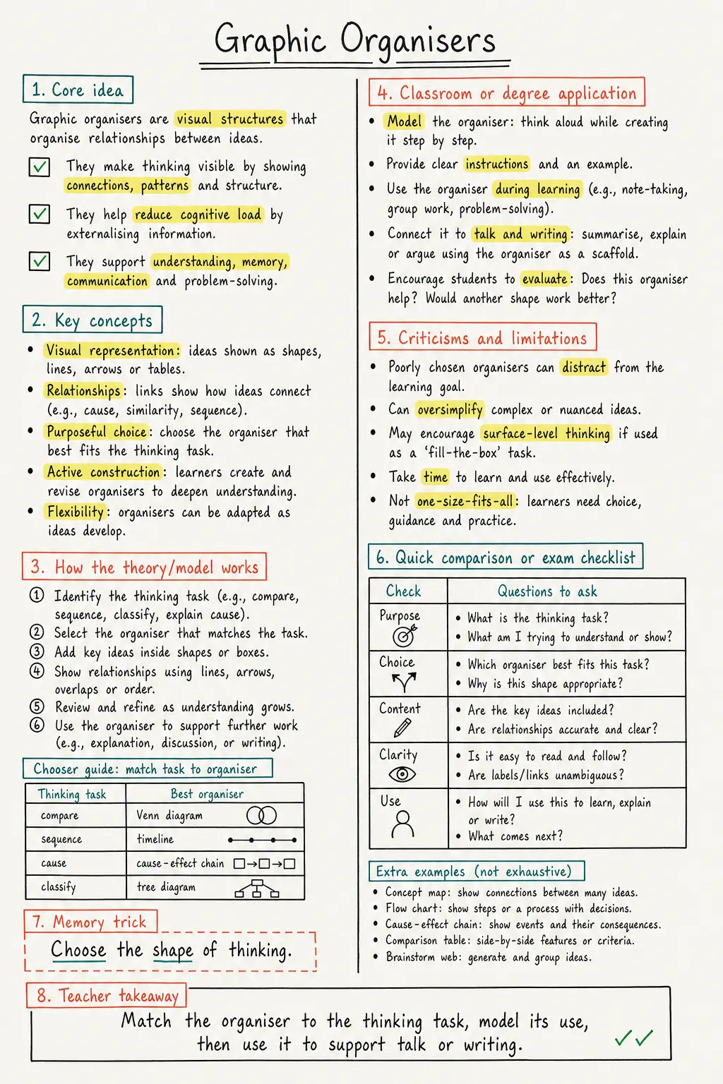
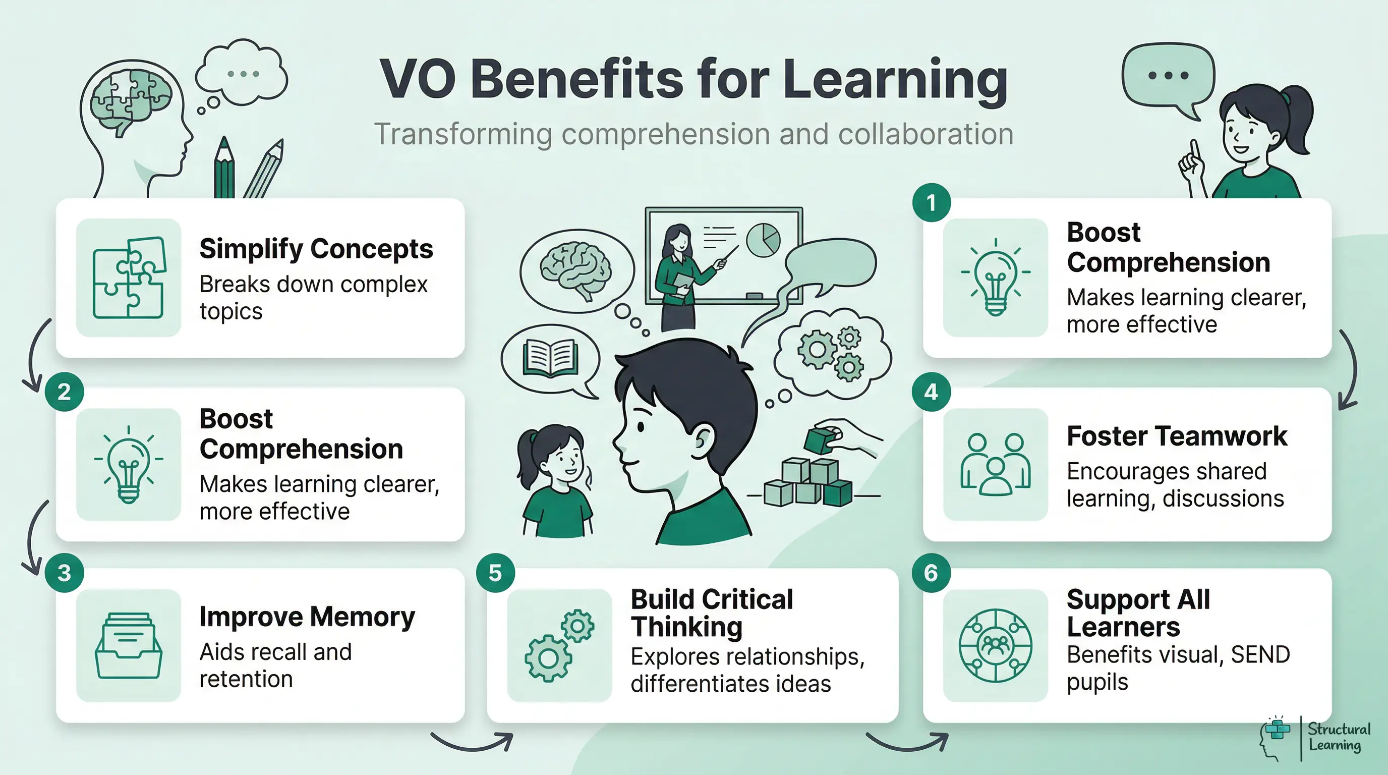
Visual organisers turn complex information into clear visuals, which helps learning. They help learners organise their thoughts and see connections (Novak, 1998). These aids include mind maps and flowcharts (Hyerle, 2009).
A visual organiser, also called a graphic organiser, is a diagram, chart or map. It structures ideas, data and concepts so learners can see relationships, sequence and hierarchy (Novak & Cañas, 2008).
Download a one-page study note for Graphic Organisers, with the key ideas, limitations and classroom links in one place.
Visual formats help learners understand challenging concepts more clearly (Winn, 1991). Teachers can use them to improve lessons and support comprehension. A visual organiser is a graphic organiser: a diagram, chart or map. It structures ideas, data and concepts so learners can see relationships, sequence and hierarchy.
Novak and Cañas (2008) argue that concept maps work when learners build propositions: two concepts joined by precise linking words. This matters because a completed sheet is not proof of understanding. A learner who writes full sentences inside boxes, or builds a single chain of ideas, can finish the task without explaining how the concepts relate.
This guide explains the main types of visual organiser. It shows how to choose them for classroom tasks. It also explains when digital tools such as Mural, Creately or school-approved whiteboards can support collaboration. The guide warns against the worksheet trap: organisers should reveal thinking for formative assessment, not become neat compliance tasks.
Clark and Dwyer (1994) found that visual organisers present information clearly. Novak and Gowin (1984) showed that these tools help learners connect concepts. Robinson (1998) found that visual organisers support learner understanding.
Novak (1998) found that visual organisers help learners sort information into a clear structure. Gurganus (2007) showed that they can build learners' critical thinking skills. Clarke (1991) noted that learners use them to explore links and keep ideas apart.
Graphic organisers can help learners who need visual structure, including many learners with dyslexia or EAL. They do not work by turning every idea into a picture. Robinson (1998) found gains in understanding and memory when the organiser shows relationships clearly. Teachers should ask for keywords, linking phrases and cross-links instead of full sentences copied into boxes, because a finished sheet can hide weak understanding.
| Type of Visual organiser | Primary Use |
|---|---|
| Concept Map | Show connections between ideas |
| Venn Diagram | Compare and contrast items |
| Sequence Chart | Display chronological order |
| Hierarchy Chart | Represent structured relationships |
| Double Bubble Map | Explore similarities and differences |
| Cluster Diagrams | Cluster related ideas or concepts |
Novak & Gowin (1984) found visual organisers help learners grasp complicated topics. Hyerle (2009) noted they support brainstorming. Marzano et al. (2001) showed they help plan lessons. Winn (1991) stated organisers benefit learners at school and work.
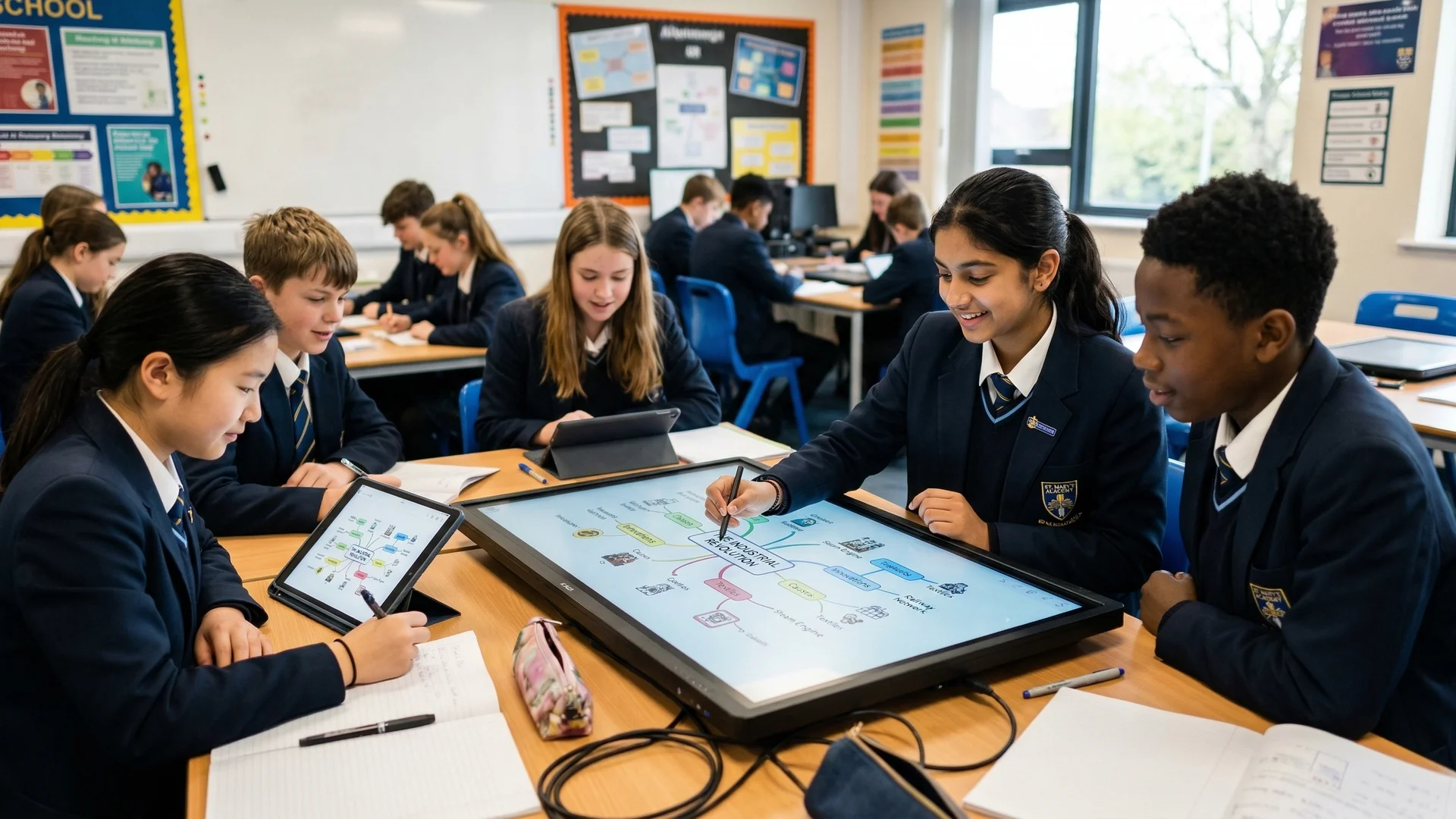
w-richtext-figure-type-image w-richtext-align-centre w-richtext-align-centre" data-rt-type="image" data-rt-align="centre">Collaborative mapping is useful when learners have to explain why two ideas are connected. Paired work can reveal misconceptions that a neat individual sheet hides: one learner can link evaporation to heat, while another challenges whether the arrow should say causes, requires or speeds up. The teacher can then use the map as formative evidence, not just a display product.
Use the organiser that matches the thinking task. Mind maps support brainstorming around a central idea; Venn diagrams compare and contrast; flow charts sequence processes; fishbone diagrams trace cause and effect; storyboards plan narratives; KWHL charts structure inquiry; hierarchy charts show classification. This matches the categories used by teacher guidance from The Bell Foundation and TeachingEnglish, British Council.
Novak and Gowin (1984) showed concept maps display concept relationships. The main idea sits at the top. Related concepts branch out with lines showing connections. They are useful for brainstorming, summarising, and exploring topics, as reported by O'Donnell et al. (2002).
Mind maps are free-form maps that start with a central idea and branch into related keywords, images and examples. They work best when learners choose and justify the branches themselves. In 2026, AI tools can produce a polished map in seconds, but viewing a generated map does not give learners the same generative learning practice as selecting, organising and integrating ideas themselves (Fiorella and Mayer, 2015).
Robinson and Schraw (1994) found learners improve schema through spatial idea organisation. This strengthens learning. The Map It approach follows this principle of learning.
Flowcharts illustrate a sequence of steps or events in a process. They use shapes, such as rectangles and diamonds, to represent different stages, and arrows to show the direction of flow. Flowcharts are ideal for teaching processes, problem-solving, and decision-making.
Venn (1880) introduced diagrams that use overlapping circles. Learners can see shared and separate features between groups. The parts that do not overlap show difference, while the overlap shows similarity. These diagrams help learners compare, connect ideas and analyse relationships.
T-charts show information in two clear columns. Learners can compare topics and note pros and cons. Teachers can use them to show advantages, disadvantages, or before and after situations. This supports clear comparison.
Ishikawa (1968) said cause and effect diagrams show why events happen. Learners start with the outcome, then map what creates it. Deming (1986) and Juran (1988) showed this helps analyse reasons and solutions.
Researchers like Mayer (2009) found storyboards help learners plan writing. Goldsmith (2008) showed they aid presentation creation. Birkenstein and Graff (2018) suggest they clarify narrative structure for all.
Start with the learning goal, then choose the simplest visual form that makes the relationship visible. Poorly aligned diagrams can create split attention when learners must coordinate teacher talk, decorative labels and crowded arrows at the same time (Sweller, Ayres and Kalyuga, 2011). Ask learners to use short labels, precise linking words and cross-links between sections; do not let them fill boxes with copied sentences.
Paivio (1971) proposed dual coding: learners process verbal and visual information through related but distinct systems. This explains why a timeline with short labels can support a history explanation better than a copied paragraph, provided the image and words point to the same idea. Mayer's multimedia learning work extends this point: words and pictures help when they are integrated and relevant, not when they decorate the page (Mayer, 2024).
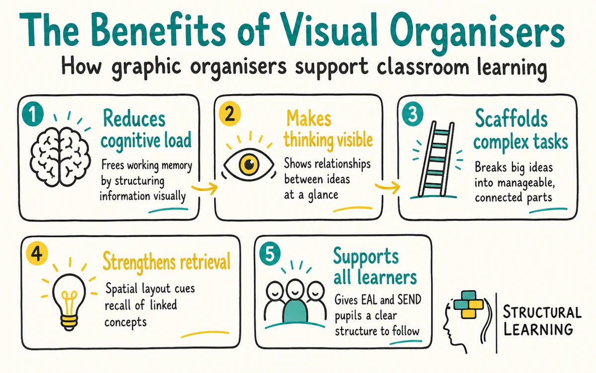
Cognitive load theory explains why organisers can help: they reduce unnecessary searching and keep relationships visible. This support disappears when the map is crowded, decorative or misaligned with the task. Hyerle (2009) framed recurring visual tools as a shared language for thinking, while split-attention research warns that poor layouts can increase load instead of reducing it (Sweller, Ayres, & Kalyuga, 2011).
Teachers see classroom gains using concept maps. Learners remember 23% more science than with notes (Novak & Gowin, 1984). Visual maps help learners link ideas and see patterns (Ausubel, 1963; Jonassen, 1990). This supports understanding and recall, say researchers (Buzan, 1993).
Across the curriculum, visual organisers should act as a shared visual language, not a set of separate templates. Senior leaders can agree on five to eight common structures, such as comparison grids, timelines, flow charts, concept maps, fishbone diagrams and KWHL charts. This helps learners, as they do not have to relearn the format in each subject. In English, story mountains can help learners plan narratives; in maths, flow charts can show problem-solving steps; in science, cause-and-effect diagrams can explain photosynthesis without relying on unverifiable subject-specific claims.
Timelines help learners put history events in order. Charts help learners compare viewpoints (Allan Paivio, 1971). Spider diagrams let learners explore geography, which can improve lessons. When visual and verbal learning work together, learners understand subjects more clearly.
Subject choice still matters. A Year 7 history class can use a fishbone diagram to explain causes of the Great Fire of London, while an English class can use a Venn diagram to compare genres. The organiser should make the thinking process visible, not decorate work after the thinking has already happened.
Visual organisers work best when matched to learner abilities. EYFS learners gain from simple, colourful picture maps (story cards). For Key Stage 1, use basic mind maps with words and images. Key Stage 2 learners manage detailed flowcharts and tables, using more text.
Secondary learners still need scaffolding, but the support should fade. In Key Stage 3, the teacher can provide a partly completed concept map with three missing links. By Key Stage 4, learners should choose the organiser, justify the choice and remove prompts once they can explain the relationships independently.
Sweller's (1988) cognitive load theory shows visuals ease learning. Teachers should match visual complexity to the learner's skills. Assess understanding to know when to use harder visual organisers.
Visual structure can reduce uncertainty for some autistic learners. It can also help learners with dyslexia keep attention on the links between ideas. Even so, support should match the individual profile rather than be assumed from a diagnosis (Milton, 2012; Lyon, 1995).
Offer more than one layout. Some learners need a sequence or hierarchy; others reason better through webs, loops, colour-coded clusters or sensory anchors. Let learners explain why they chose a structure, then check whether it helps them retrieve and apply the idea.
Vygotsky (1978) argued that tools and social interaction can support learners inside the zone of proximal development. In practice, collaborative mapping lets SEND learners use strengths such as spatial reasoning, verbal rehearsal or pattern spotting. Dweck (2006) is useful here only if teachers link effort to strategy: "Your map improved because you changed the linking words," not because the page looks tidy.
Use visual organisers as thinking tools, not worksheets. Choose the format that matches the learning goal, model how to add precise linking words, and ask learners to revise the map after feedback. The strongest evidence is not a tidy page; it is whether learners can explain, apply and improve the relationships they have mapped.
Start with one shared routine: model a worked map for a current topic, remove some labels for guided practice, then ask learners to build and justify their own version. Keep examples from The Bell Foundation, TeachingEnglish, Twinkl, Louise Selby Dyslexia Specialist and Internet Geography in mind, but adapt each template to the knowledge and task in front of the class.
Venn diagrams and double bubble maps are the most effective tools for comparing and contrasting different concepts. A Venn diagram uses overlapping circles to highlight shared traits and differences between two or three subjects. For more detailed comparisons, a double bubble map provides a clearer structure to organise specific attributes side by side.
Visual aids help learners remember what they learn. Research supports dual coding, which means using words and visuals together to improve memory (Education Endowment Foundation). This helps all learners, especially those who find learning hard (Education Endowment Foundation).
Common mistakes include using the wrong diagram, giving too little modelling and accepting copied text as evidence of understanding. Ask learners to use short labels, precise linking words and cross-links between different parts of the map (Novak & Cañas, 2008). If a learner can explain why one arrow says "causes" and another says "depends on", the organiser is doing more than keeping them busy.
Free for teachers. The platform builds a classroom-ready lesson plan from your topic in under two minutes.
Visual organisers are not neutral aids. Poorly matched diagrams can increase extraneous cognitive load, especially when learners must split attention between decorative shapes, long labels and teacher talk (Sweller, Ayres and Kalyuga, 2011). A neat map can also hide shallow thinking. Novak and Cañas (2008) warned that concept maps depend on accurate linking phrases and cross-links; without them, learners may copy sentences into boxes and appear fluent while missing relationships.
The evidence base also has boundary conditions. Dexter and Hughes (2011) found positive effects for graphic organisers, but many studies test recall, summarising or near-transfer tasks rather than novel GCSE or A level problem solving. Teachers should treat the organiser as a scaffold, not proof that learners can apply the idea unaided. Paul Black's assessment work makes a related point: the artefact only matters when it gives the teacher usable evidence about current understanding (Black, 1998).
There are cultural and inclusion limits as well. Hierarchical charts can favour tidy taxonomies, which are fixed systems for sorting ideas. This can push aside associative, narrative or place-based forms of knowing (Yunkaporta, 2009). Some neurodivergent learners may reason through webs, loops or sensory anchors, rather than fixed top-down categories.
Milton raises a similar concern in his critique of one-way interpretations of autistic communication (Milton, 2012). In the AI era, ready-made concept maps can reduce the generative work that supports learning (Fiorella and Mayer, 2015). Visual organisers still have value when used with care. But learners need to build, explain and revise the relationships themselves.
Black, P. (1998). Inside the black box.
For further academic research on this topic:
Visual organisers should have simple drag-and-drop functions. Cross-device access helps learners work together. Platforms may offer concept map templates (Novak, 1972).
Even so, allow learners to adapt these. Learners can use multimedia, like images, videos, and links (Jonassen, 1999).
Introduce one tool at a time, offering structured support. Learners can start with mind maps for vocabulary revision. Later, they progress to concept maps for science or history. Cloud tools help learners collaborate, while teachers give real-time feedback (Jonassen, 2006).
Lai (2011) found that digital visual organisers help teachers adapt lessons. Higgins et al. (2019) showed that accessibility tools support different learners. Beauchamp & Parkinson (2008) noted that digital work builds learner skills and understanding.
Visual organiser design starts with a clear aim. Know which learning objective and thinking skill you want to support before you start. Concept maps work well for understanding (Novak, 1972).
Timelines help learners with chronological events. The layout should reflect the thought process needed (Ausubel, 1968).
Colour coding helps learners organise their work if consistent. Assign colours to topics, themes, or difficulty. For networks, use green for producers, orange for consumers, and red for predators. This supports learners in making connections and grasping topics.
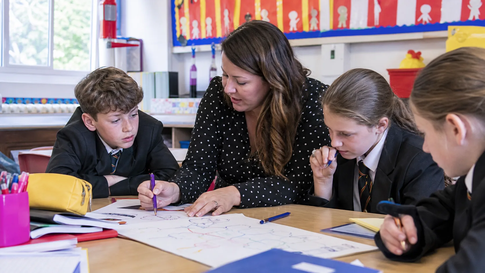
Scaffolding supports learner success with new topics. Visual organisers work well; create them together by thinking aloud (Fisher & Frey, 2013). Then, learners finish partially completed templates (Pearson & Gallagher, 1983). Learners boost skills by creating their own organisers.
Avoid packing in too much information. Keep visual organisers simple so they help learners understand, rather than confuse them.
Use key phrases instead of long sentences, and leave white space.
Research by researchers like Novak (1998) shows regular checks help improve visual organisers. Track learner engagement, and assess learning from these tools. Ask for feedback on the best formats for different tasks and subjects (Ausubel, 1960; Mayer, 2009).
Dual-coded. Print-ready. Free for teachers.
Open a free account and help organise learners' thinking with evidence-based graphic organisers. Reduce cognitive load and guide schema building responsively.