Classroom Display That Actually Supports Learning: An Evidence-Based Guide
Working walls, knowledge organisers, anchor charts, and SEND displays. Evidence on visual clutter and the display diet principle.

Working walls, knowledge organisers, anchor charts, and SEND displays. Evidence on visual clutter and the display diet principle.
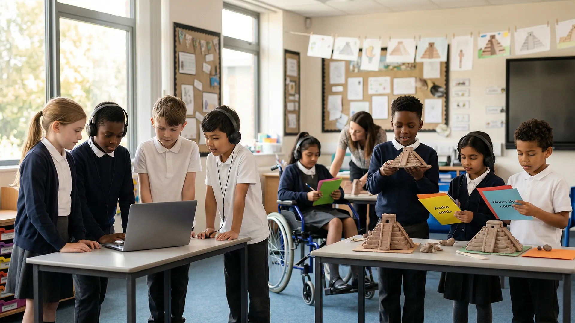
A visitor enters a Year 3 classroom. The walls are *covered*: laminated posters of the letter sounds, a rainbow of emotions, a timeline of British monarchs, birthday celebrations, artwork from every learner, vocabulary mats, numbers 1–100, alphabet posters. The effect is visually rich, warm, colourful—and cognitively overwhelming. The teacher admits, "I think I have too much on the walls, but I want learners to see themselves reflected in the room."
A second classroom, same year, same ability range: walls are sparse. One wall has a large paper titled "Our Water Cycle" with evolving diagrams and learner annotations updated daily. Another has an Anchor Chart (procedure steps with sketches) laminated and referenced repeatedly. A third displays the current "working wall" with labelled diagrams and thinking routine outputs. The effect is calm and purposeful.
Fisher, Godwin and Seltman (2014) found that heavily decorated learning spaces increased distraction and reduced learning gains in young children. The practical conclusion is not "bare walls"; it is to keep displays tied to current learning, easy to scan and low in visual clutter.
Researchers Duke and Carlisle (2011) found effective displays help learners. We differentiate decorative from useful displays. Learn to make powerful working walls using research from Archer and Hughes (2011). Follow the "display diet" by Fisher, Frey, and Hattie (2016) to reduce visual distractions.
Purpose: Create a welcoming, warm environment. Celebrate learner work.
Display boards often have fixed layouts, changed with the seasons. They show finished learner artwork and class photographs. Birthday displays and motivational posters are also common (Fisher, 2011; Higgins et al, 2001).
Learning impact: Minimal. Display walls are motivational (learners like seeing their work celebrated), but they're not teaching tools. Learners glance at them once, then they become invisible—part of the background.
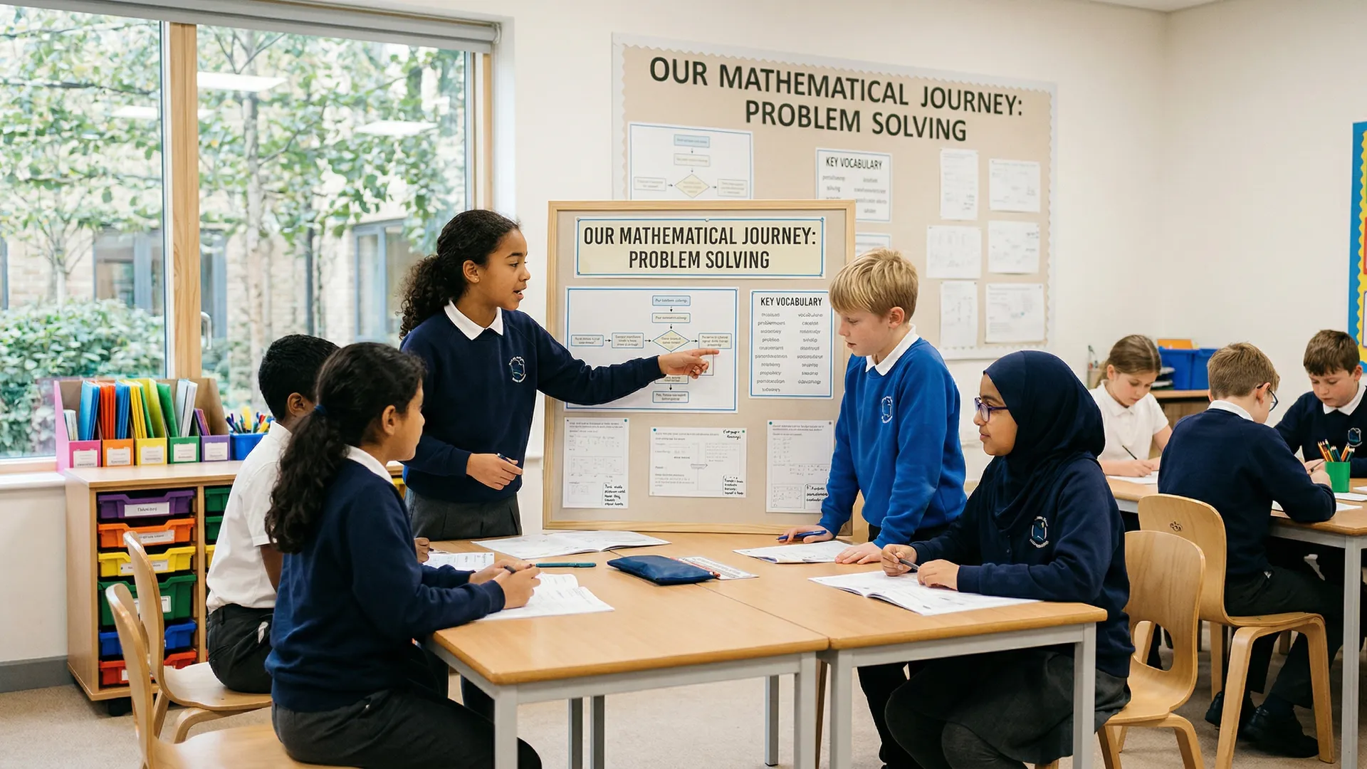
Purpose: Make thinking and learning processes visible. Support current learning.
Working walls offer current information. They connect directly to today's topics, stay unfinished and change as the unit develops. Teachers use them during lessons so learners can revisit vocabulary, examples, misconceptions and developing explanations.
Learning impact: Significant. Working walls serve as "external memory"—learners refer back to them, reducing cognitive load. They model thinking processes. They show learning progression (how understanding changed over time).
Research: Treat working walls as a classroom scaffolding routine rather than a strategy with a verified fixed retention percentage. They are most defensible when they display current models, vocabulary, worked examples and learner thinking that the teacher actively refers to during instruction.
A working wall for "The Water Cycle" (current topic) has immediate relevance. A wall for "Classroom Rules" (evergreen) has less impact—it's not a thinking tool for active learning.
Working walls display key topics like photosynthesis this month. Learners explore evolving thinking routines together. Show problem-solving as it happens in class. This is a practical application of scaffolding: temporary support that helps learners complete tasks before the support is faded (Wood, Bruner & Ross, 1976).
Avoid evergreen procedures (class rules, lunch procedures) on walls. Do not keep completed units or general vocabulary there. Focus on materials learners are actively using now (Fisher & Frey, 2014). Working walls boost learning when they are current (Duke & Carlisle, 2011).
A working wall should change visibly. On Monday, it shows initial observations. By Friday, it shows refined understanding with new diagrams, corrected misconceptions, and learner annotations.
How to make working walls active:
A working wall crammed with tiny writing defeats its purpose. Learners can't read it from their seats, so they don't use it.
Design principles:
A working wall should show learner thinking, not just your inputs. Include:
This signals that the wall is *theirs*—a shared thinking space, not your information broadcast.
Week 1: Introduce the Concept
Large A2 paper. Title: "What is Place Value?" Four columns: Hundreds | Tens | Ones | (space for examples).
You model: "The number 247. Where's the 2? In the hundreds place—that means 2 × 100. Where's the 4? In the tens place—4 × 10. Where's the 7? In the ones place—7 × 1."
Draw base-ten blocks under each: two 100-blocks under Hundreds, four 10-blocks under Tens, seven 1-blocks under Ones.
Week 2: Add Learner Examples
Each learner rolls dice to make a two- or three-digit number. They draw it using base-ten blocks in the "Examples" column. Learner Amir's number is 153. His drawing: one 100-block, five 10-blocks, three 1-blocks. Write it in: "Amir's number has 1 hundred, 5 tens, and 3 ones."
Week 3: Add Misconceptions and Corrections
A learner says, "25 is two tens and five." Pause. Write on the wall: "Is 25 two tens and five? No! Two tens and five is 25, but we say: two tens and *five ones*. Why? Because place value names what each digit *represents*."
Add a new section: "Common Mistakes (and why they're not quite right)."
Week 4: Final Review
Before moving on, review the entire wall with learners. "What have we learned? How does this help us with addition and subtraction?" (Preview: understanding place value helps you understand regrouping.)
Photograph the wall and move it to storage. Begin a new working wall for the next concept.
Knowledge organisers are one-page summaries of a topic's concepts. Unlike evolving working walls, they are designed as reference tools. Learners use them repeatedly throughout a unit (Wiliam, 2018).
Knowledge organisers can be useful when teachers actively teach from them, return to them during retrieval and use them to organise key vocabulary and relationships. Treat claims about fixed percentage gains cautiously unless a study directly reports that outcome.
What a knowledge organiser includes:
Example: Knowledge organiser for "Fractions" (Year 4).
How to display and use it: Post the knowledge organiser where learners can see it (not tucked away). Refer to it constantly: "Remember our fraction organiser? Where's the numerator?" Learners use it during independent work. By unit end, many will have internalised the content *and* the organiser structure.
An anchor chart is a step-by-step visual guide to a procedure or strategy. Unlike knowledge organisers (conceptual), anchor charts are operational: "How do I do this?"
Examples:
Design principles:
How to use anchor charts: Create them *together* with learners (model the first 1–2 steps; learners suggest the rest). Post it. During lessons, point to it: "Remember Step 3?" Over time, learners internalise the procedure and anchor charts fade from frequent use—success, they've learned it.
Researchers (e.g., Hodgdon, 1995; Mirenda & Iacono, 2009) found visual supports help learners. These tools reduce anxiety and boost independence for those with speech issues. Visual aids also help learners with autism (Ganz, 2007) and developmental delays.
Purpose: Show the sequence of activities in a day, reducing uncertainty and anxiety.
Design: A series of pictures (photos or symbols) showing each activity in sequence: Arrival → Registration → English → Break → Maths → Lunch → PE → Home.
How to use: Learners "read" the timetable at the start of the day and when transitioning between activities. The visibility reduces meltdowns caused by "What's next?"
Purpose: Show immediate next steps, preventing anxiety and the "what am I supposed to do?" paralysis.
Design: Two pockets on a board. "Now" shows current activity (with picture/symbol). "Next" shows what comes after.
Classroom use: A learner finishes a task and looks at the Now-Next board: "I just finished my handwriting. Next is maths." They move to maths without asking, reducing teacher load and boosting learner independence.
Purpose: Help learners communicate emotional state, especially those with limited speech.
Design: A scale with faces: Happy → Okay → Worried → Angry → Upset. Include simple icons (smile, straight face, worried eyes, red face, tears).
Classroom use: "How are you feeling right now?" Learner points to the face. This prevents behaviour escalation (you catch frustration before it becomes anger) and gives all learners—especially non-verbal learners—a way to communicate.
Purpose: Show available choices, reducing decision paralysis and supporting autonomy.
Design: 4–6 options with pictures and simple labels. "Activity options: Reading | Maths | Art | Building | Computer | Writing."
Classroom use: Learners choose their activity from the board. For learners with decision anxiety, limiting choices (4 vs. unlimited) supports engagement.
Visual timetables, rules and routines can reduce ambiguity for learners who find transitions or unstructured spaces difficult. Use them as supports for predictability and independence rather than as a guaranteed behaviour-reduction percentage.
Fisher et al. (2014) measured the effect of visual clutter on learner attention. In cluttered classrooms (walls covered with posters, bright colours, multiple stimuli), learners' sustained attention was *8 minutes shorter* than in organised classrooms. Over a year, that's hundreds of hours of lost focus.
Classrooms need more than bare walls: strategic displays can make the room welcoming while keeping attention on current learning. The strongest evidence here supports high-quality, functional and uncluttered environments (Fisher, Godwin and Seltman, 2014; Higgins et al., 2005; Woolner, 2010).
Walk your classroom and categorise every display:
Keep:
Consider removing:
For every display, ask: "If a learner glances at this for 6 seconds, what will they learn or be reminded of?" If the answer is "not much," it's candidate for removal.
Examples:
Don't try to overhaul displays once yearly. Instead, maintain a monthly rhythm:
Week 1 of Month: Photograph current working wall. Begin new working wall for next topic.
Week 2 of Month: Review SEND supports. Are they still working? Update choice boards if needed.
Week 3 of Month: Rotate learner artwork. Remove pieces older than 6 weeks.
Week 4 of Month: Audit posters and displays. Remove anything not referenced. Clean and reposition knowledge organisers.
This prevents displays from becoming tired and ensures the room always serves current learning.
Visual clutter can overwhelm learners with ADHD, autism or processing differences. Too many competing cues make it harder to filter distractions and find the information that matters. Reduce clutter first, then add only the displays learners actually use during the task.
SEND-friendly classroom displays:
Minimal, visually structured classrooms can make expectations clearer. Clear timetables, visible routines and uncluttered resource areas reduce ambiguity and support independence.
DO:
DON'T:
Classroom displays matter. Working walls show learner thinking and aid learning. Knowledge organisers lessen cognitive load by presenting info. Anchor charts make procedures clear. SEND displays build independence and lower anxiety.
Researchers found organised classrooms help learners (Tanner, 2008). Minimal displays boost wellbeing and learning (Woolner, 2010). Cluttered, decorative classrooms hinder learners, say researchers (Fisher, Godwin & Seltman, 2014).
This month, audit your displays using the "six-second look" test. Remove anything that doesn't serve current learning. Create or refresh one working wall for a topic you're teaching. Post it, reference it daily, and watch learners use it as a thinking tool. That's the evidence-based classroom display.
Open a free account and help organise learners' thinking with evidence-based graphic organisers. Reduce cognitive load and guide schema building dynamically.